All you need to know about infographics (+ their recipe)
If students were asked by their teacher about the definition of "infographic", they normally wouldn't need much time to come up with a straightforward answer (of course, after getting over the confusion of hearing such an unusual request). A student chosen at random could answer: "they are graphics which contain information". And it is true, partly...
But it is so much more than that. I mean, there is a whole Wikipedia article about it.
Welcome to the entry of your dreams, the most exciting, breathtaking and appealing (yes, all at once) piece of information you may ever find: an entry about everyone's favourite kind of chart, the infographic.
First of all, I am sure that you cannot wait to read the standard dictionary definition: a visual representation of information or data, e.g. as a chart or diagram. Others may explain, in different words, a similar thing:"a collection of imagery, charts, and minimal text that gives an easy-to-understand overview of a topic". Generally, what we all come to agree with is that infographics can make our life easier. I will show you why with a daily-life issue:
Imagine you are studying four History topics for an exam but, unfortunately, you are finding it difficult to memorise everything, and (most importantly!) you are unsure if you are going to remember the following morning what you revised. In that case, is there anything that you could do? Why not make an infographic, or look for one at Google? According to those definitions, they help us understand concepts better!
However, do you know why that happens?
As you already know, infographics use striking, engaging visuals to communicate information quickly and clearly... and this information is transferred like that because experts say that the brain can process pictures all at once, but it takes much longer for it to obtain information from text. Humans receive input from all five of their senses(sight, touch, hearing, smell, taste), but they receive significantly more information from vision than any of the other four. Fifty percent of the human brain is dedicated to visual functions, and images are processed faster than text. So, infografics are greatly effective for studying, because of their visual element.
The image below, about palm reading, is a great example which tells how pictures helps us get data into our heads faster. But it’s crucial to remember that the visuals in an infographic must do more than excite and engage. They must help us understand and remember the content of the infographic, as seen:
- Marketing (to build brand awareness and boost engagement)
- Freelancing (to help clients visualise project timelimes)
- Small businesses (to reach an audience)
- Education: they are a magnificient way to get your message across through homework or essays
- Recruiting workers (see the image at the right)
- Presenting survey data (e.g. elections)
- Comparing data
Recipe for a sweet infographic
Ingredients
-Preexisting written text
-A blank page to make your draft
Steps
1. Determine the important points of your content.
2. Determine the title, headers, subheaders and facts. Organise in sections and keep it short and descriptive.
3. Consider the length of paragraphs and points. Keep the text brief and to the point.
4. Choose the right type of infographic template (statistical, timeline, comparison, list...) to create your layout, once you've got everything planned.
5. Use lines, borders, and shapes to group related information, and use images, icons, and illustrations to make key points memorable.
6. Pick one color that contrasts with all of the other colors in the graphic, and use it to make the most important information stand out.
7. Create a text hierarchy with three different font styles
8. Check your finished infographic and make sure that you have made your information as planned: easy to digest ;)
Personally, I have learned a lot from infographics (I didn't know that they were so popular!), and I am sure that, next time I have to revise English grammar, I will try to find one. They are fun, unique and can make subjects more appealing to students. I believe that, if they were less underrated in school, some of us wouldn't have to stay for hours in front of a textbook.
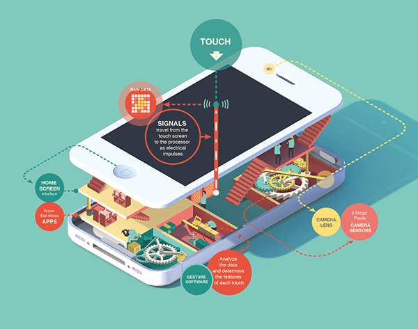
Before I leave, I feel compelled to giving you (as it would be expected) an infographic about the topic of this entry.
I hope that you have enjoyed reading this article, because I felt like I had to share this investigation project to the world. It was an entry worthy of being in my random window.


Hey! I love your topic! It's obvious that you know very well what infographics are. Also infographics are a great tool to study
ResponderEliminarHahaha, thanks!! Yes, I am an expert now :) I totally agree with you, they are great for studying!
EliminarI'm sad that I can't comment with an inphographic... I made a graphic about how much interesting are these posts. And they're all stupendous! But I'm sure a graphic will prove it better than this comment... (?) Thank you very much for such a great blog! :-)
ResponderEliminarHi, thanks for commenting! Thanks for your kind words... and yes, an image is worth a thousand words! :)
EliminarThis is so useful!! For real! I'm going to take this into account to make better infographics to study. Thank you ;)
ResponderEliminarThanks Valentino! ;)
EliminarI see that infographics are very important and useful. Good topic!
ResponderEliminarThank you, Zoe! Yes, they are really useful!
EliminarHaha I love it! I think infographics are very useful and I find this post really original as well as entertaining (#infographicsappreciationpost)
ResponderEliminarOmg, love that hashtag. I am glad that you enjoyed it, hahaha #infographicsappreciationcomment
Eliminar